The Observatorio COVID Uruguay plays a crucial role in centralizing knowledge, data, and statistical tools related to the COVID-19 pandemic. A unit under UMAD (Unidad de Métodos y Acceso a Datos), this platform serves as a gateway for academics, decision-makers, media professionals, and the general public to better understand the evolving pandemic situation through curated visualizations, datasets, and analysis. Focused on both global and Uruguayan realities, the site bridges the gap between statistical evidence and social behavior during periods of confinement and mobility changes.
Main Functions of Observatorio COVID Uruguay
- Knowledge Dissemination
- Disseminates reliable and structured COVID-19 information.
- Translates complex data into accessible formats.
- Helps various stakeholders understand pandemic dynamics.
- Data Consolidation
- Integrates data from global, regional, and national sources.
- Offers real-time insights from multiple databases.
- Compiles indicators relevant to Uruguay’s pandemic response.
- Visualization Tools
- Provides graphs, charts, and comparative analysis.
- Highlights social trends and epidemiological developments.
- Simplifies large datasets into user-friendly formats.
- Evidence-based Decision Support
- Informs public policy formulation.
- Enables comparative evaluation of mobility and containment.
- Tracks responses and impacts across different regions.
Key Areas of Focus
1. Epidemiological Indicators
- Monitors daily and cumulative cases.
- Tracks testing rates and mortality figures.
- Provides per-million comparisons across continents.
2. Social Impact and Behavioral Trends
- Assesses public behavior using mobility data.
- Measures social distancing and lockdown adherence.
- Analyzes workplace and recreational patterns.
3. Comparative Analysis
- Allows cross-country comparisons of pandemic metrics.
- Contextualizes Uruguay’s standing globally.
- Uses uniform indicators for statistical accuracy.
Main Datasets and Indicators Available
| Dataset | Description | Frequency of Update | Purpose |
|---|---|---|---|
| Positive Cases per Million | Tracks the number of confirmed infections per million inhabitants | Daily | Helps assess outbreak intensity |
| Tests per Million | Shows testing volume in population-adjusted terms | Daily | Gauges testing reach and capacity |
| Deaths per Million | Measures the mortality rate linked to COVID-19 | Daily | Indicates pandemic severity |
| Mobility Data by Google | Reflects movement in parks and workplaces | Weekly | Captures behavioral response to policies |
| Departmental Data (19 regions) | Breaks down indicators by region in Uruguay | Weekly | Offers localized pandemic snapshots |
Global and Continental Comparisons
- Five Continents Compared
- Offers side-by-side statistics on infection, testing, and death rates.
- Helps locate Uruguay's performance on a global map.
- Enables strategic alignment with countries showing best practices.
- Visual Benchmarking Tools
- Graphs illustrate COVID-19 trajectories.
- Death curves and case surges are easily tracked.
- Charts simplify the understanding of complex datasets.
Regional Insights within Uruguay
- Departmental Mobility Patterns
- Data from Google reflects public adaptation to restrictions.
- Parks and workplace mobility compared across 19 departments.
- Helps identify regions with high or low compliance.
- Localized Outbreak Management
- Maps infections to specific regions.
- Supports targeted health interventions.
- Prevents one-size-fits-all policies.
User Groups and Beneficiaries
| User Group | Utility of Observatorio COVID |
|---|---|
| Academics and Researchers | Access to structured, credible COVID datasets for empirical studies |
| Policy Makers | Reliable evidence to support health and economic policies |
| Journalists and Opinion Leaders | Timely updates for public dissemination and reporting |
| General Public | Simplified access to understand pandemic dynamics and safety practices |
Noteworthy Contributions by UMAD
- Evidence-Driven Tools
- Indicators processed by UMAD highlight key changes in behavior and health trends.
- Emphasize the relationship between containment measures and real-world mobility.
- Real-Time Monitoring
- Continuous updates enable timely policy decisions.
- Comparative tracking ensures Uruguay remains informed about its global positioning.
- Global Data Portals Integration
- Portal links users to broader academic resources and visualizations.
- Encourages participation in international data communities.
Examples of Indicators Processed
| Indicator | Source | Interpretation |
|---|---|---|
| Mobility in Parks | Google Mobility Reports | Decline indicates public compliance with lockdowns |
| Mobility in Workplaces | Google Mobility Reports | Decrease suggests transition to remote work |
| Test Rate | National health databases | High test rates indicate stronger detection systems |
| Case Curve | Daily COVID bulletins | The Rising curve indicates accelerating transmission |
| Departmental Outbreak Data | UMAD-processed stats | Reveals localized hotspots |
Benefits of Data Centralization
- Enhanced Transparency
- Promotes trust through open access to health data.
- Reduces misinformation by presenting verified facts.
- Quick Data Interpretation
- Designed for both technical and non-technical users.
- Infographics and maps simplify comprehension.
- Flexible Usability
- Supports research, policy evaluation, and public information campaigns.
- Encourages civic engagement through data literacy.
Collaborative Nature of the Platform
- International Academic Collaboration
- Connects with global researchers working on pandemic studies.
- Showcases Uruguayan contributions in international forums.
- Open Access to Tools
- Publicly accessible dashboards and indicators.
- Encourages adaptation and replication in other regions.
- Continuous Improvement
- Updates reflect evolving methodologies.
- User feedback informs content enhancement.
Visualization Features
| Feature | Function |
|---|---|
| Interactive Graphs | Enable users to select countries, departments, or timeframes |
| Trend Lines | Show movement in cases or mobility patterns over time |
| Heat Maps | Represent intensity of outbreaks by region |
| Comparative Sliders | Offer before-and-after snapshots of mobility |
Future Implications
The Observatorio COVID Uruguay has become an indispensable platform for synthesizing pandemic-related data and turning it into actionable knowledge. Through its commitment to transparency, regional focus, and continuous updates, the observatory not only empowers Uruguayan citizens and institutions but also contributes meaningfully to global pandemic discourse. A thoughtful blend of visualization and data science ensures that complex trends become understandable, leading to informed actions in both the health and social domains.
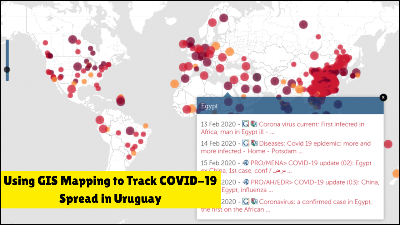
Using GIS Mapping to Track COVID-19 Spread in Uruguay

Data Visualization Tools for Public Policy Decision-Making

How the WHO Guidelines Were Applied Locally in Uruguay

COVID-19 Documents, A Detailed Review of Socioeconomic, Methodological, and Statistical Insights

Behavioral Science in Pandemic Policy Design

COVID-19 Observatory, Educational Dimension in Uruguay

How Political Ideology Influenced Public Health Attitudes
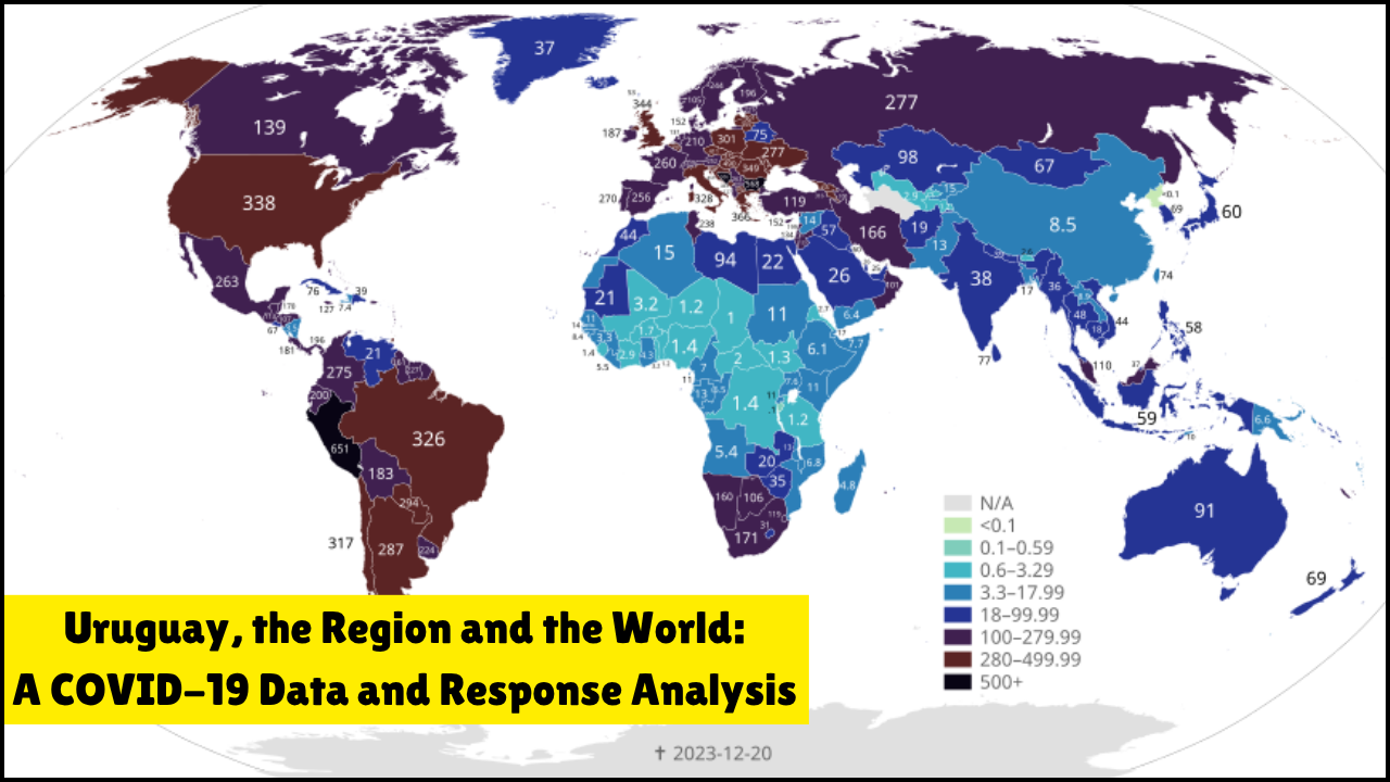
Uruguay, the Region and the World, A COVID-19 Data and Response Analysis

Methods and Data Access Unit, Innovation in Social Sciences Research
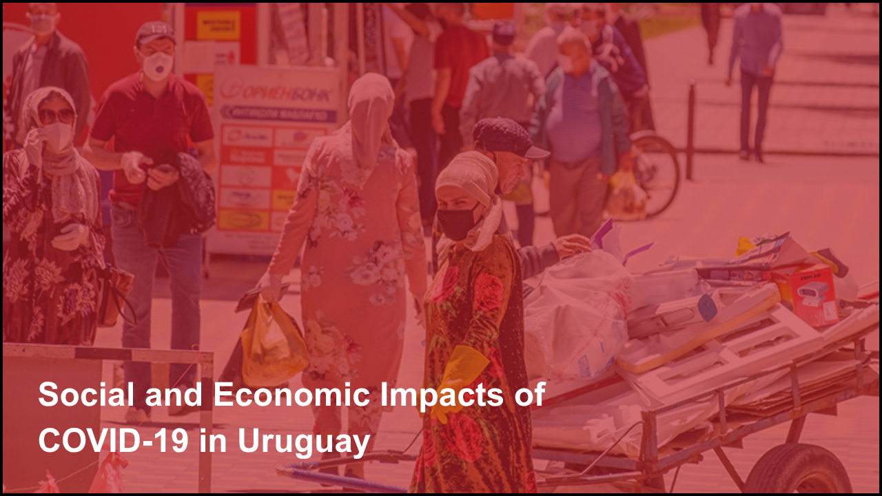
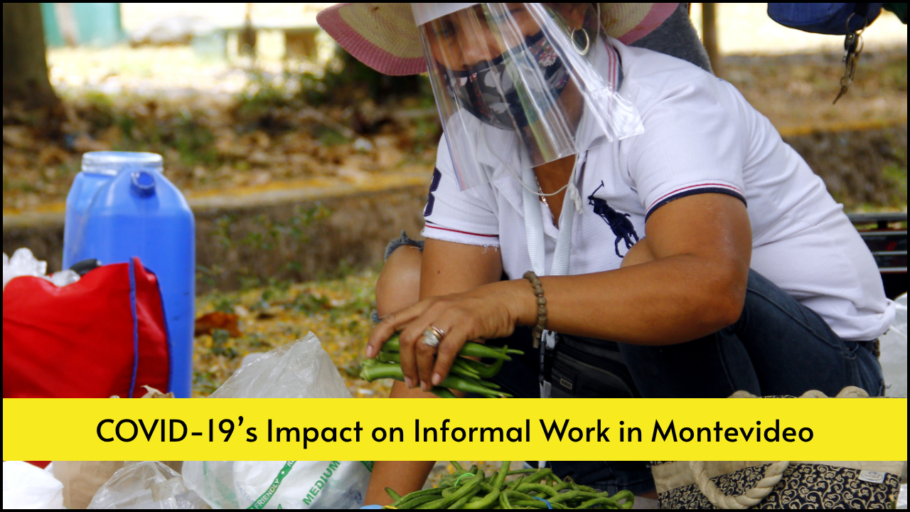
Social and Economic Impacts of COVID-19 in Uruguay

Challenges of Accessing Real-Time Health Data in Latin America