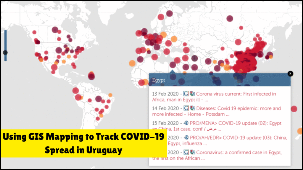
Geographic Information System (GIS) mapping provided a transformative method for analyzing and controlling the spread of COVID-19 in Uruguay. Real-time spatial data and geolocation tools helped authorities monitor infections, allocate resources, and make informed decisions. Uruguay, with its comparatively smaller population and strong digital infrastructure, effectively adopted GIS techniques to enhance pandemic response strategies. This approach highlighted the power of location-based data in managing public health emergencies.
Table of Contents
Key Benefits of GIS Mapping in Uruguay’s COVID-19 Response
Real-time monitoring: Live case updates allowed accurate spatial tracking of infected zones.
Better decision-making: Officials could prioritize interventions in high-risk areas based on geospatial analysis.
Enhanced public communication: Interactive dashboards visually displayed infection trends to the public.
Integration with health records: GIS tools were linked with testing and vaccination databases for data consistency.
Resource allocation: Hospitals, testing centers, and quarantine zones were optimized using mapping tools.
Technological Infrastructure Used in Uruguay
Component
Details
GIS Software
Esri ArcGIS, QGIS, and local GIS solutions
Mobile Apps
Coronavirus UY app with geolocation tracing
Dashboards
Web-based interactive dashboards with map layers
Cloud Services
Government-linked cloud databases for real-time sync
Data Sources
Ministry of Health, local clinics, and WHO databases
Core GIS Strategies Deployed
Hotspot identification: Clusters of COVID-19 were pinpointed on the map using infection density layers.
Route tracking: Travel histories of infected individuals were geocoded to identify transmission paths.
Health facility mapping: Hospitals, clinics, and temporary COVID care centers were tagged for accessibility.
Demographic overlays: GIS layers included age, socio-economic status, and vulnerability indices.
Vaccination centers plotting: Locations for immunization were optimized for rural and urban coverage.
Timeline of GIS-Based COVID Monitoring in Uruguay
Time Period
GIS Mapping Milestones
March 2020
Initial GIS dashboards launched to display confirmed case locations.
April 2020
Mobile tracking integrated with mapping tools to identify contacts.
June 2020
Geospatial risk zones marked and updated daily on public platforms.
October 2020
Integration of GIS with vaccination planning begins.
February 2021
Real-time vaccine tracking has been added to mapping tools.
August 2021
Post-vaccination cluster monitoring was conducted through spatial models.
Collaboration Between Institutions
Institution
Role in GIS Implementation
Ministry of Public Health
Provided health data and guided policy decisions
AGESIC (Agency for E-Government)
Led tech infrastructure and data privacy standards
UDELAR (University of the Republic)
Assisted in spatial data modeling and analytics
Esri Uruguay
Supplied GIS technology and training
National Emergency System
Coordinated field response using geospatial data
COVID-19 Tracking Features Enabled Through GIS
Interactive heatmaps: Public users and officials viewed evolving heatmaps of infection hotspots.
Contact tracing maps: Individuals’ interactions and movement paths were visualized for containment.
Quarantine zone borders: Dynamic zoning allowed lockdown areas to be redefined based on infection spread.
Community alert systems: Residents in affected zones received automated alerts through geotagging.
Public dashboard tools: Color-coded visualizations provided district-wise data on cases, recoveries, and deaths.
Challenges in Implementing GIS Solutions
Challenge
Impact
Data accuracy concerns
Inconsistent case reporting disrupted real-time mapping
Privacy regulations
Ensuring user data protection delayed contact tracing tools
Limited technical capacity
Rural regions lacked GIS-trained personnel
Internet access gaps
Mapping accessibility was low in remote or underconnected zones
Integration complexity
Syncing health records with spatial systems posed delays
Innovative GIS Features Introduced
Predictive modeling: Future case surges were forecasted based on historical movement data and population density.
Symptom mapping via app: Citizens self-reported symptoms, which were geolocated for early intervention.
Layer customization: Dashboards allowed users to filter maps by gender, age, and vaccination status.
Spatial-temporal analysis: Spread patterns over time were analyzed using dynamic timeline visualizations.
Real-time heat exposure mapping: Risk levels were assigned to public areas based on density and airflow conditions.
Public Engagement Through GIS Platforms
Engagement Type
Description
COVID Map Viewers
Citizens accessed live maps to understand local threat levels
Open Data Portals
Health and spatial data sets were made publicly downloadable
App Push Notifications
Users received GIS-based alerts on travel safety
Community Feedback Tools
Residents submitted local updates for map corrections
Educational Campaigns
Public workshops were held to explain how GIS mapping worked
Impact of GIS Mapping on Uruguay’s Pandemic Outcome
Faster containment: Early identification of clusters allowed timely isolation and testing.
Efficient vaccination rollout: Rural and urban populations received equitable access through geo-based planning.
High citizen trust: Transparency of data through maps enhanced community cooperation.
International recognition: Uruguay’s GIS-led model was cited as a best practice in South America.
Data-informed recovery: Reopening of schools, transport, and businesses was phased through map-guided zones.
Comparison With Non-GIS Approaches in Other Countries
Feature
Uruguay (With GIS)
Without GIS Mapping
Response Speed
Immediate, localized actions
Delayed due to manual case aggregation
Accuracy
High spatial precision
Risk of overlapping or missing case locations
Public Communication
Clear visual tools for all
Often limited to text-based updates
Vaccination Strategy
Geospatial optimization
Distribution gaps in remote zones
Quarantine Management
Zone-specific lockdowns
Entire cities or regions are affected uniformly
The Way Forward
GIS mapping offered Uruguay a powerful mechanism to combat the COVID-19 crisis with precision, speed, and transparency. Public agencies, academic institutions, and tech providers collaborated effectively to build a robust spatial data network. The success of GIS applications not only reduced the spread of the virus but also positioned Uruguay as a regional leader in smart public health strategy. Future health crises can benefit greatly from the lessons learned through Uruguay’s innovative use of geospatial intelligence.
She is a creative and dedicated content writer who loves turning ideas into clear and engaging stories. She writes blog posts and articles that connect with readers. She ensures every piece of content is well-structured and easy to understand. Her writing helps our brand share useful information and build strong relationships with our audience.