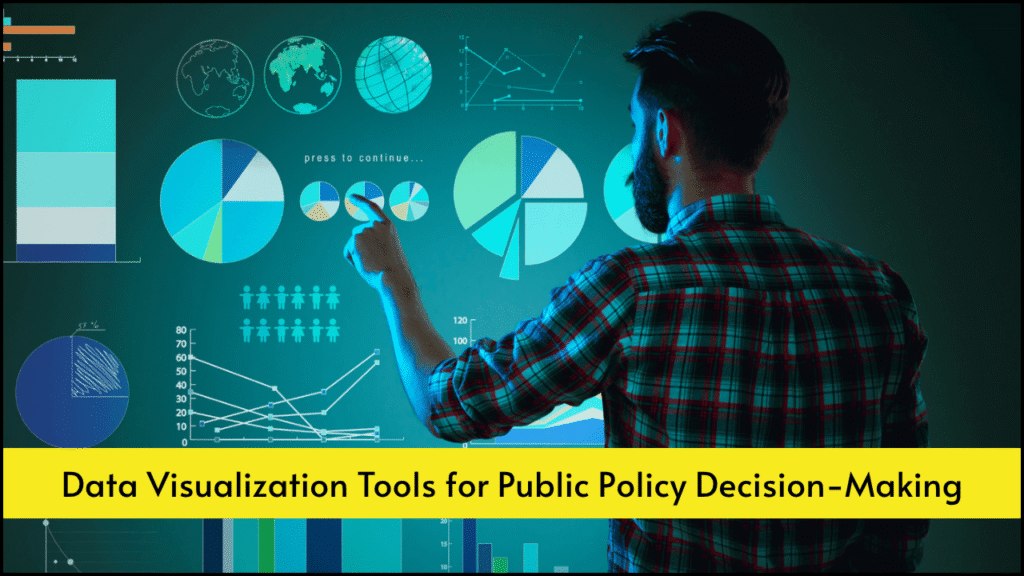
Public policy decisions often involve analyzing large volumes of complex data. Effective decision-making requires clarity, precision, and evidence-based interpretations. Data visualization tools play a critical role in transforming raw datasets into visual formats that policymakers can easily understand. These tools not only improve communication but also enhance transparency, accountability, and responsiveness. A well-crafted visualization can illuminate patterns, correlations, and anomalies that might otherwise be missed in spreadsheets or reports.
Table of Contents
Key Benefits of Data Visualization in Policy Making
- Improved Communication
- Data visuals help simplify complex datasets.
- Charts and graphs allow faster understanding for both technical and non-technical audiences.
- Enhanced Decision-Making
- Trends and forecasts become clear through visual interpretation.
- Decision-makers can identify areas that need urgent intervention.
- Real-Time Monitoring
- Dashboards provide live updates on program performance.
- Early warning signs help avert crises in sectors like health and environment.
- Public Transparency
- Interactive platforms share government performance with the public.
- Citizens can better understand how policies impact them.
Popular Data Visualization Tools in Public Policy
| Tool Name | Key Features | Policy Use Case | Strengths |
|---|---|---|---|
| Tableau | Drag-and-drop interface, rich dashboard creation, data blending capabilities | Budget analysis, health program tracking | High interactivity, broad data source support |
| Power BI | Seamless Microsoft integration, AI-powered insights, real-time reporting | Education policy evaluation | Easy to use for MS users, strong dashboards |
| QGIS | Geospatial mapping, spatial analysis, open-source | Urban planning, environmental zoning | Strong mapping capability, cost-effective |
| Google Data Studio | Free access, live data connection, interactive sharing | Public finance visualization | Zero cost, web-based sharing, Google sync |
| R (ggplot2, Shiny) | Statistical analysis with visualization, custom app development | Epidemiological studies, social behavior | Flexibility, suitable for researchers |
| D3.js | JavaScript-based, high customization, scalable vector graphics | Custom data storytelling tools | Fully customizable, ideal for web platforms |
| Infogram | Templates, interactive infographics, collaborative tools | Voter turnout or demographic presentations | Quick visuals, good for public-facing reports |
| Plotly | Python/R compatibility, interactive dashboards, open-source option | Transportation analysis, policy simulation | Cross-platform, detailed visualizations |
Applications of Data Visualization in Various Policy Domains
1. Health Policy
- Disease Spread Maps show infection clusters using tools like QGIS or Tableau.
- Vaccine Distribution Dashboards provide a real-time status of logistics.
- Performance Indicators, such as infant mortality or nutrition, can be visualized for quick comparisons.
2. Education Policy
- Enrollment and Dropout Rates can be plotted to identify underperforming regions.
- Learning Outcomes visualizations using Power BI help track curriculum effectiveness.
- Digital Literacy Access Maps built with GIS tools pinpoint digital divide locations.
3. Environmental Policy
- Air Quality Index trends over time using Google Data Studio or R.
- Deforestation Visuals highlight illegal logging areas via satellite mapping tools.
- Water Resource Maps inform sustainable usage through geographic overlays.
4. Economic Policy
- Employment Rates by sector and region allow identification of distressed zones.
- Income Distribution Graphs provide transparency in inequality measures.
- Budget Allocation Charts offer clarity in government expenditure across sectors.
5. Urban Development
- Traffic Congestion Maps visualize peak-hour bottlenecks.
- Affordable Housing Heatmaps identify high-need areas.
- Smart City Dashboards track lighting, water usage, and public transport in real-time.
Criteria for Selecting a Data Visualization Tool
| Criteria | Explanation |
|---|---|
| User Accessibility | Tools should be user-friendly for non-technical decision-makers. |
| Integration Ability | Compatibility with existing data sources like Excel, SQL, and APIs. |
| Interactivity | Stakeholders should be able to filter, sort, and engage with visuals. |
| Scalability | Tools must handle large datasets as policy decisions expand in scope. |
| Customization | Visuals should be tailored to specific policy narratives or audiences. |
| Cost and Licensing | Budget constraints must be considered, especially for public agencies. |
Challenges in Implementing Visualization Tools
- Data Silos
- Disconnected databases limit unified visualization efforts.
- Low Digital Literacy
- Policymakers in some regions may lack training in tool usage.
- Poor Data Quality
- Inaccurate or outdated data leads to misleading visuals.
- Privacy Concerns
- Sensitive citizen data needs secure visualization platforms.
- Technical Infrastructure
- High-end visualization tools require stable internet and hardware setups.
Best Practices for Effective Data Visualization in Policy
- Start with Clear Objectives
- Define what insights the visualization should reveal.
- Use Appropriate Visual Formats
- Bar charts for comparisons, line charts for trends, maps for geospatial insights.
- Maintain Data Integrity
- Visuals must accurately represent the data without manipulation.
- Ensure Accessibility
- Colorblind-friendly palettes and readable fonts improve inclusiveness.
- Iterate with Stakeholder Feedback
- Visuals should be refined based on the response from target users.
Emerging Trends in Visualization for Public Policy
| Trend | Description |
|---|---|
| AI-Enhanced Visualization | Machine learning suggests key insights and recommends visualization formats. |
| Real-Time Dashboards | Live updates for rapid response during crises like pandemics or floods. |
| Mobile-Friendly Visuals | Ensures data is accessible on smartphones by field workers and the public. |
| Narrative Storytelling | Combines visuals with explanatory text for a more persuasive policy case. |
| Open Data Platforms | Public dashboards linked to government datasets promote citizen engagement. |
Case Studies of Visualization Impact in Policy
- India’s COVID Dashboard
- Tableau and Power BI-powered dashboards tracked case numbers and oxygen availability, influencing lockdown strategies.
- New York City Crime Mapping
- GIS tools provided real-time maps to police departments, reducing response times.
- Kenya’s Budget Transparency Portal
- Google Data Studio visuals increased public awareness about national expenditures.
- European Union Emissions Tracker
- D3.js enabled interactive maps showing cross-country pollution trends.
Parting Insights
Data visualization tools have become essential instruments in the public policy toolkit. These tools allow policymakers to extract, understand, and communicate key insights in an accessible and visually engaging format. Their ability to turn complexity into clarity ensures that decisions are more transparent, informed, and impactful. By integrating visualization into decision-making, governments can bridge gaps between data, policy, and people more effectively.